Ophthalmology Clinic Opens Elevated Medical Spa
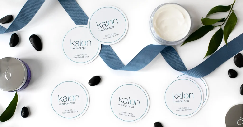
Kalon Medical Spa bridges the gap between medical precision and aesthetic rejuvenation, creating a serene space where clients can embrace their inner and outer beauty.

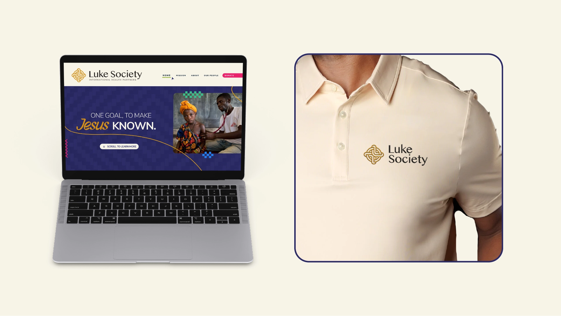
Kalon Medical Spa bridges the gap between medical precision and aesthetic rejuvenation, creating a serene space where clients can embrace their inner and outer beauty.
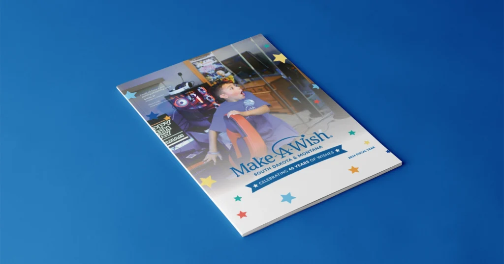
Since 2016, MJM has been helping Make-A-Wish South Dakota & Montana share the impact of their work with a newsletter magazine.
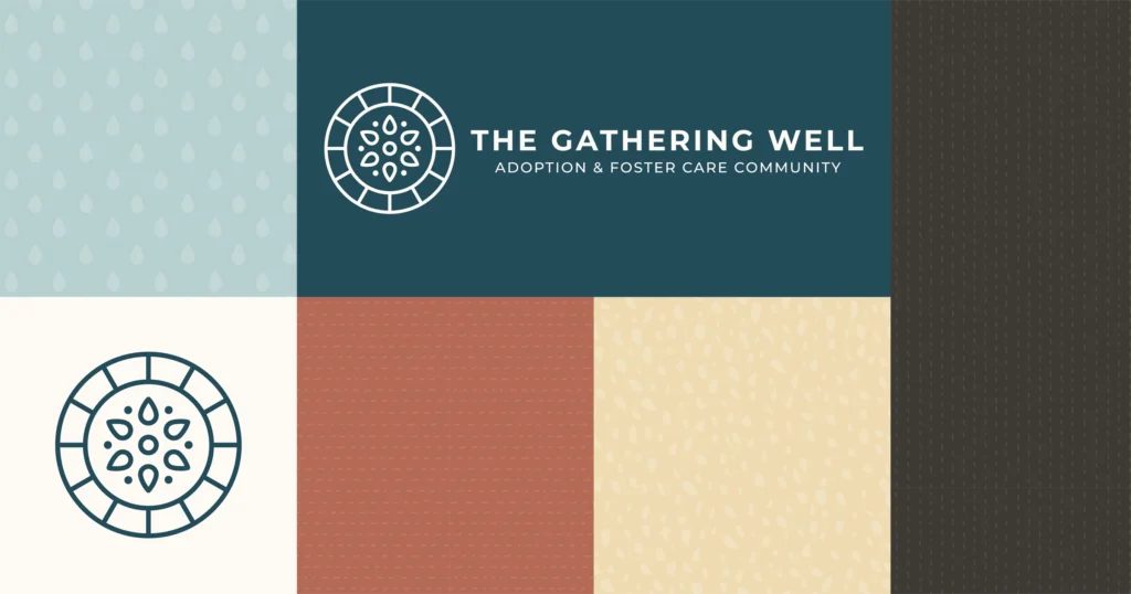
After establishing their identity, MJM has continued to support The Gathering Well as they grow and adapt to better serve their community.
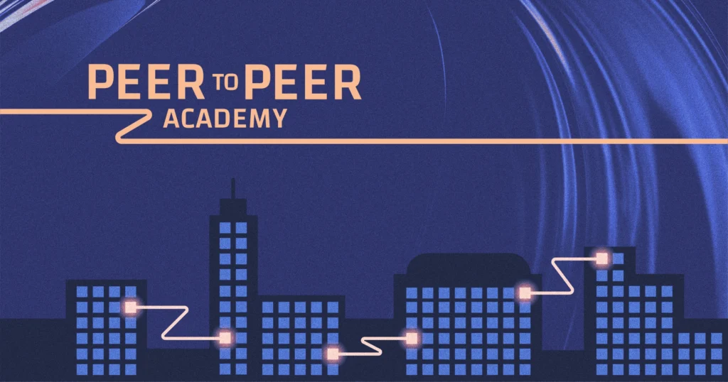
Peer-to-Peer Academy unites experts in ophthalmology and optometry through unplugged conversations rooted in real-world experience.